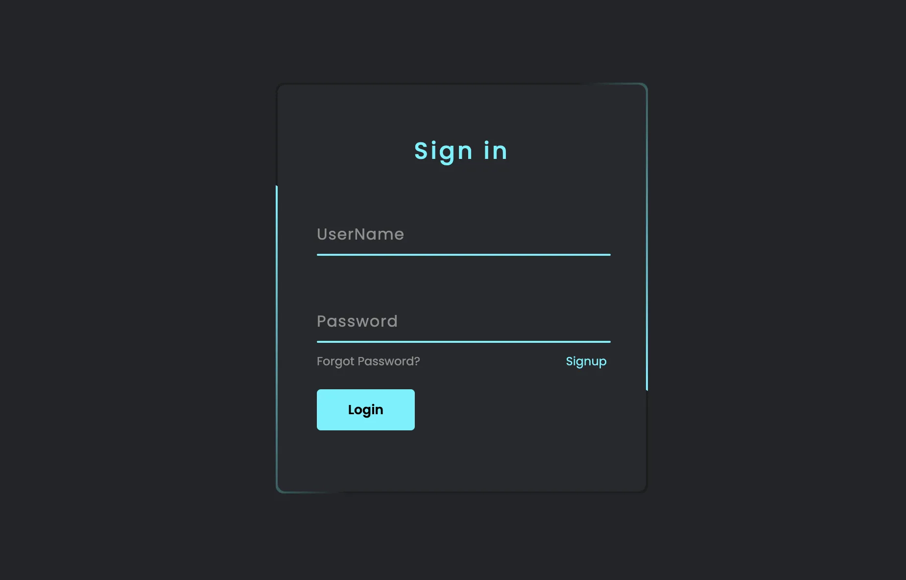
该文本是一个HTML文档,展示了一个渐变效果的登录页面。页面使用了CSS样式来创建一个美观的表单,包含用户名和密码输入框,以及登录和注册链接。背景为深色,输入框和按钮采用渐变色,具有动画效果,提升用户体验。
<!DOCTYPE html>
<html lang="zh">

<head>
    <meta charset="utf-8">
    <title>渐变登录页</title>
    <meta name="viewport" content="width=device-width, initial-scale=1">
    <style>
        /* 引入需要的字体 */
        @import url('https://fonts.googleapis.com/css2?family=Poppins:wght@300;400;500;600;700;800;900&display=swap');

        * {
            margin: 0;
            padding: 0;
            box-sizing: border-box;
            font-family: 'Poppins', sans-serif;
        }

        body {
            display: flex;
            justify-content: center;
            align-items: center;
            min-height: 100vh;
            flex-direction: column;
            background: #23242a;
        }

        .box {
            position: relative;
            width: 380px;
            height: 420px;
            background: #1c1c1c;
            border-radius: 8px;
            overflow: hidden;
        }

        .box::before {
            content: '';
            z-index: 1;
            position: absolute;
            top: -50%;
            left: -50%;
            width: 380px;
            height: 420px;
            transform-origin: bottom right;
            background: linear-gradient(0deg, transparent, #45f3ff, #45f3ff);
            animation: animate 6s linear infinite;
        }

        .box::after {
            content: '';
            z-index: 1;
            position: absolute;
            top: -50%;
            left: -50%;
            width: 380px;
            height: 420px;
            transform-origin: bottom right;
            background: linear-gradient(0deg, transparent, #45f3ff, #45f3ff);
            animation: animate 6s linear infinite;
            animation-delay: -3s;
        }

        @keyframes animate {
            0% {
                transform: rotate(0deg);
            }

            100% {
                transform: rotate(360deg);
            }
        }

        form {
            position: absolute;
            inset: 2px;
            background: #28292d;
            padding: 50px 40px;
            border-radius: 8px;
            z-index: 2;
            display: flex;
            flex-direction: column;
        }

        h2 {
            color: #45f3ff;
            font-weight: 500;
            text-align: center;
            letter-spacing: 0.1em;
        }

        .inputBox {
            position: relative;
            width: 300px;
            margin-top: 35px;
        }

        .inputBox input {
            position: relative;
            width: 100%;
            padding: 20px 10px 10px;
            background: transparent;
            outline: none;
            box-shadow: none;
            border: none;
            color: #23242a;
            font-size: 1em;
            letter-spacing: 0.05em;
            transition: 0.5s;
            z-index: 10;
        }

        .inputBox span {
            position: absolute;
            left: 0;
            padding: 20px 0px 10px;
            pointer-events: none;
            font-size: 1em;
            color: #8f8f8f;
            letter-spacing: 0.05em;
            transition: 0.5s;
        }

        .inputBox input:valid~span,
        .inputBox input:focus~span {
            color: #45f3ff;
            transform: translateX(0px) translateY(-34px);
            font-size: 0.75em;
        }

        .inputBox i {
            position: absolute;
            left: 0;
            bottom: 0;
            width: 100%;
            height: 2px;
            background: #45f3ff;
            border-radius: 4px;
            overflow: hidden;
            transition: 0.5s;
            pointer-events: none;
            z-index: 9;
        }

        .inputBox input:valid~i,
        .inputBox input:focus~i {
            height: 44px;
        }

        .links {
            display: flex;
            justify-content: space-between;
        }

        .links a {
            margin: 10px 0;
            font-size: 0.75em;
            color: #8f8f8f;
            text-decoration: beige;
        }

        .links a:hover,
        .links a:nth-child(2) {
            color: #45f3ff;
        }

        input[type="submit"] {
            border: none;
            outline: none;
            padding: 11px 25px;
            background: #45f3ff;
            cursor: pointer;
            border-radius: 4px;
            font-weight: 600;
            width: 100px;
            margin-top: 10px;
        }

        input[type="submit"]:active {
            opacity: 0.8;
        }
    </style>
</head>

<body>
    <div class="box">
        <form autocomplete="off">
            <h2>Sign in</h2>
            <div class="inputBox">
                <input type="text" required="required">
                <span>UserName</span>
                <i></i>
            </div>
            <div class="inputBox">
                <input type="password" required="required">
                <span>Password</span>
                <i></i>
            </div>
            <div class="links">
                <a href="#">Forgot Password?</a>
                <a href="#">Signup</a>
            </div>
            <input type="submit" value="Login">
        </form>
    </div>
</body>

</html>